Visual Language: Taipei Logo

This week's assignment was to create a logo for a city of my choice. I chose Taipei, the capital of Taiwan.

I first analyzed the Chinese characters and the meaning behind them. I then created a mind map of what Taipei means to me. I also asked several of my classmates who have been or lived in Taipei to give me some additional feedback. 

With this information, I started sketching out some possible logos. My process was basically trying to combine two or three of the identities that were present in the mindmap. 

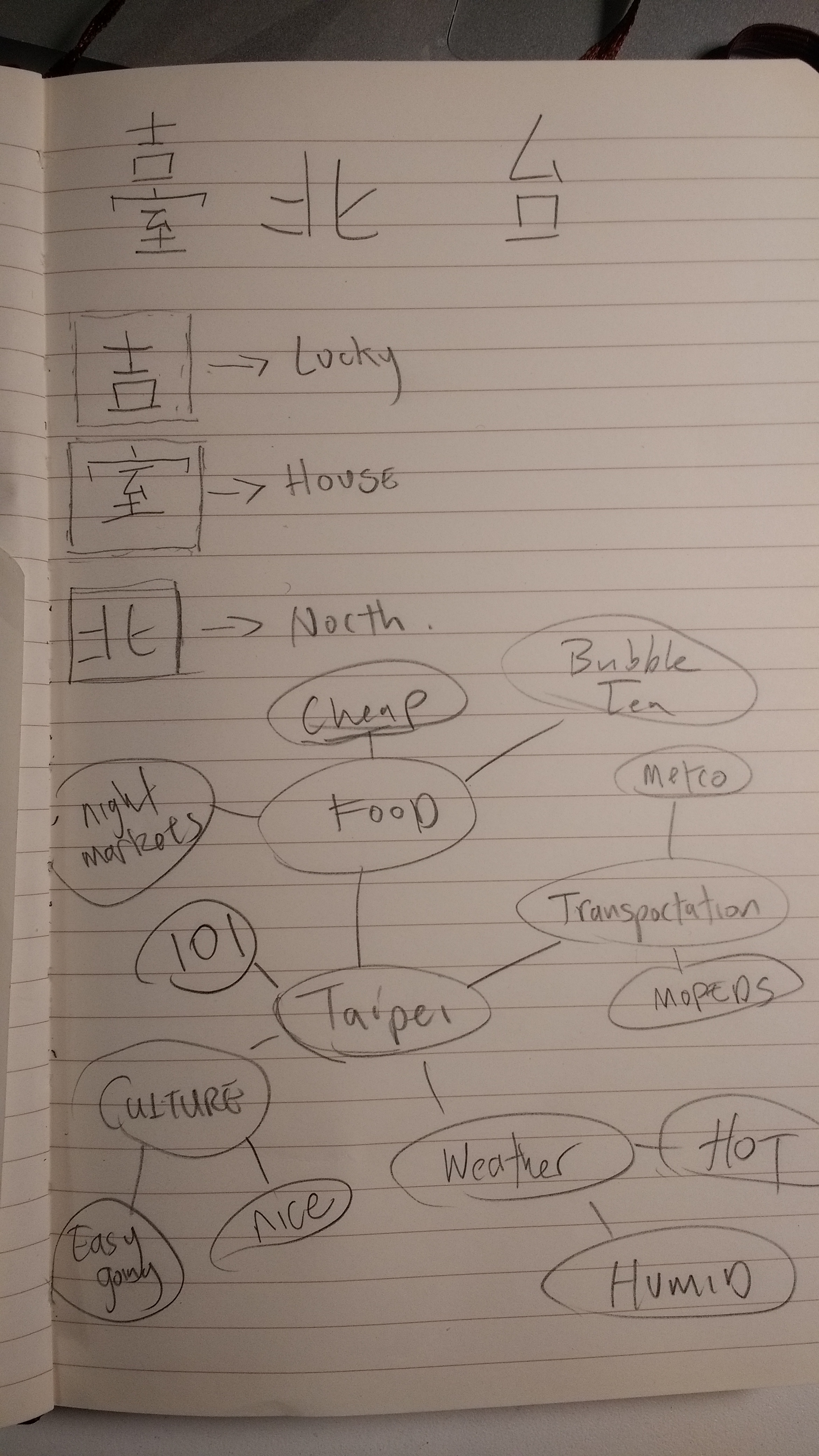
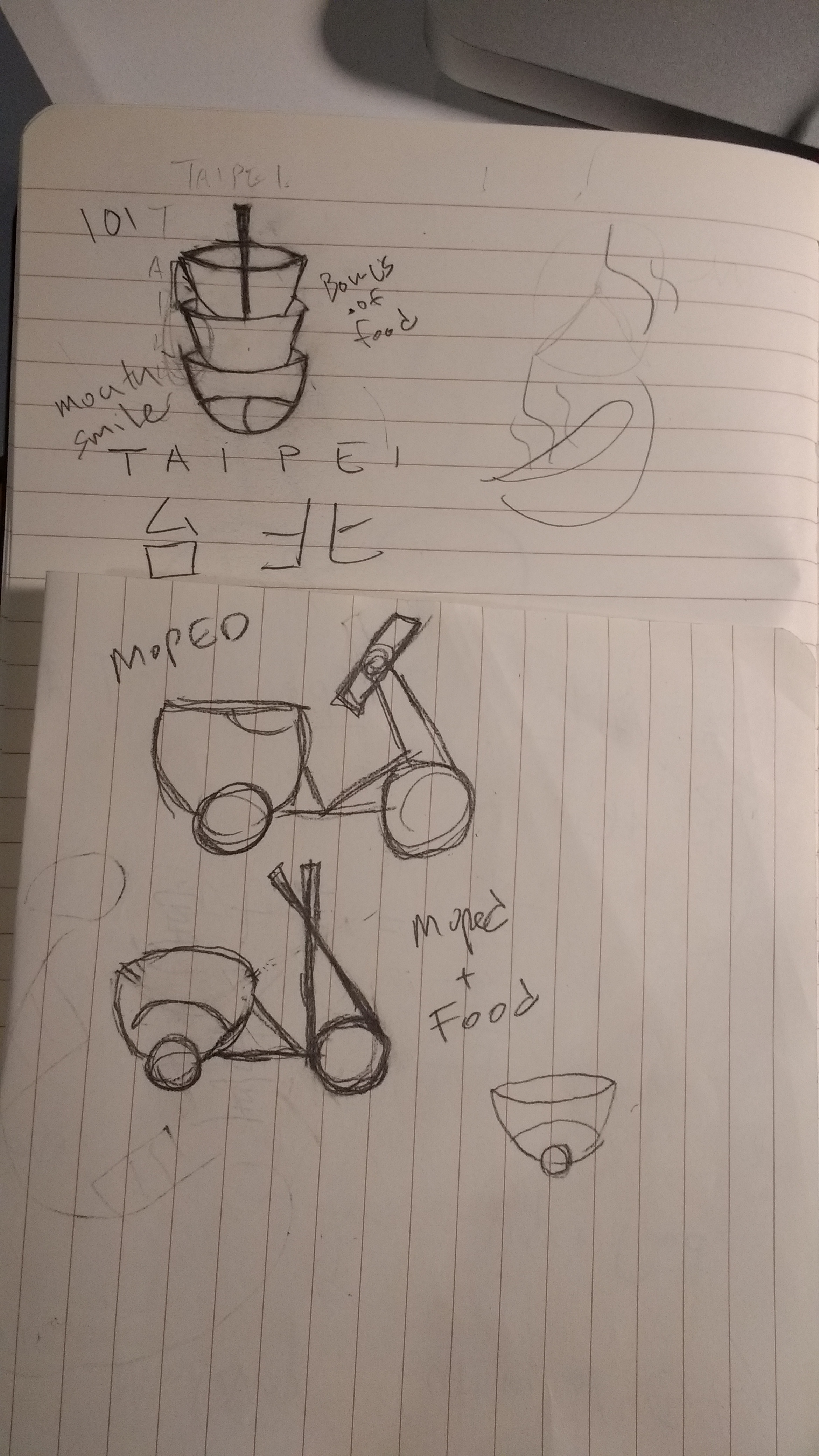
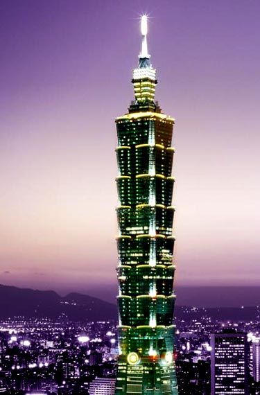
I knew that I wanted to incorporate food into the logo because everybody associates Taipei with the street food available at the iconic night markets. Another identity I wish to incorporate was the moped/scooter. These are everywhere in Taipei and remind me of the city whenever I see one. Lastly, was the Taipei 101 skyscraper. I was at first very hesitant to incorporate the building since it seemed so cliche. But it was hard for me not to include it due to its overwhelming presence in the city. 

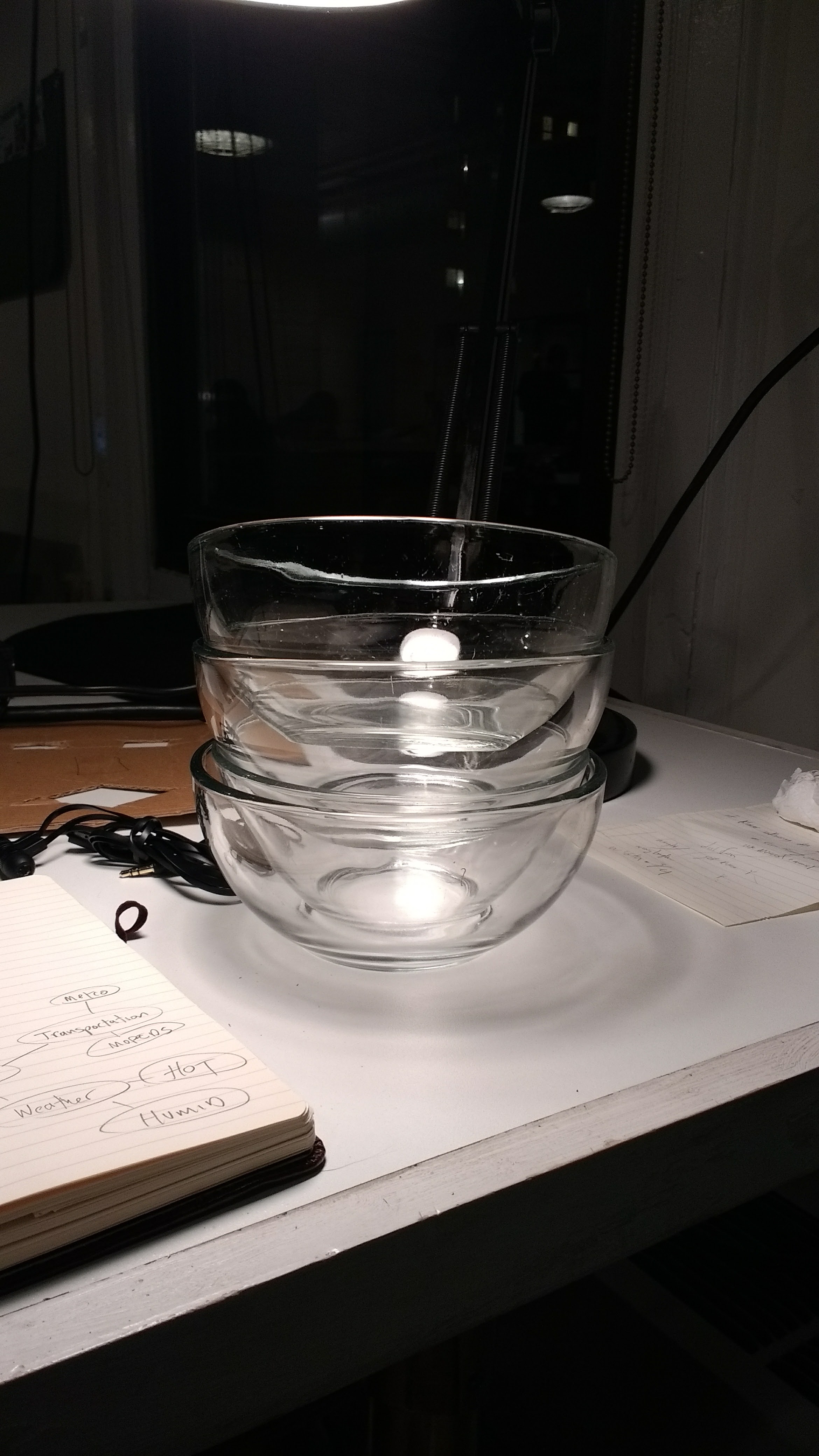
I eventually ended up incorporating the food and the 101 identities for my logo, mostly inspired by a stack of bowls. Taipei 101's unique structure looks like several sections of the building are stacked on top of each other. I then used bowls because one of Taipei's most famous foods is the Taiwanese beef noodle soup. After sketching out a rough sketch, I started working on the logo digitally.

Above was the first draft of my logo. I found that the heat lines at the top of the logo did not look right. I wanted to show heat because the temperature in Taipei is incredibly hot and humid, but these heat lines didn't really convey this sort of intense heat. It eventually led me to turn these heat lines into noodles. I also felt that the removal of the outlines made the logo feel a lot less cartoony and cliparty.

Here is the final product. I put together several logos using different colors. I also situated them on a moped helmet and a t-shirt.

Special thanks to Siman Li for helping me in this design progress!

Visual Language: Business Card

Here's my business card! It took me a long time to come up with an idea of what I wanted. I originally wanted to try to use lots of noise and "overwhelm the eye", but it looked way too messy and unprofessional. Software engineers should not be known for their messy code, so I scrapped that idea and went for something a bit more clean and minimalistic. 

I used the color red because it is a very lucky and strong color in Chinese culture. I also used two non-serif fonts (Futura and Avenir) as my type because I liked how clean it looked with the card. My name being on the edge of the card was done so that the first thing a person would see when pulling out my business card would be my name.

Since I did not come from a design background, I asked a couple of my classmates who do for advice and inspiration. Special thanks to Diana Na and Grau Recarens for the help!

Visual Language: Color

Here's my score for the hue test. I think the scoring system is not totally right...

Since I started school at ITP, my life has been elevators, subways, and sometimes some trees. Although it sounds a bit sad, I'm still enjoying myself. 

The below image consists of the main colors from my collected photos. The hierarchy I chose is simply the altitude where these colors appear. For example, from blue skies, to green trees. To the grey elevators and to the eclectic colors I see in the advertisements of the N and R trains. This eyeball represents the sort of insomnia I'm experiencing these days.

Visual Language: Typography

I have chosen six typefaces that describe me.

  • Inconsolata
  • Courier New
  • Comic Sans
  • Press Start 2P
  • Vidaloka
  • Special Elite

Because of my programming background, I chose two monotype typefaces: Inconsolata and Courier New. I am starting to see Inconsolata more and more these days in modern text editors, and when I see Courier, it automatically makes me think about programming.

Comic Sans is chosen because it reminded me of the simple days of elementary school. A time when people didn't really judge you based off what font you're using. Comic Sans is kind of seen as an ancient joke nowadays. Hopefully it makes a comeback.

I liked Vidaloka mainly because of the lowercase 'y'. My name is Bryan. So even though it's not that big of a deal, it still gets inconvenient when people take down or refer to me as Brian through emails, even when the correct spelling is right in front of them. I thought that if the 'y' was more special or looked nicer, people would remember it a bit more.

I chose Special Elite and Press Start 2P simply due to my interests. I love watching film and I love played video games. Special Elite reminds me of the type on film scripts, and Press Start 2P is a reference to the low bit text that appeared on early video games.

I placed horizontal guidelines along each typeface to look at the differences in the cap height, x height, baseline, and descender.

Creating expressive text was simultaneously frustrating and fun. It took me pages of random doodlings before I got to my final three choices. My process was to write down random words and think about what things relate to those words.

I would then look at the letters used and figure out if there were any special characteristics that could be used to represent the relationship to the word. I ended up with split, sword, and nail.

Visual Language: Design Analysis

I chose the famous movie poster from the Steven Spielberg movie Jaws. I knew that I wanted to analyze a movie poster and Jaws was one that immediately sprung to my mind. Although it is visually simple, it is intensely memorable.  I decided to figure out why this movie poster is such a staple in classic American film.


Hierarchy

There are three main elements in the poster: the title, the woman, and the shark. They are all approximately the same width and are all centered within the page. However, in terms of height, the shark takes almost 50% of the poster height, and all it's showing is its head. This loudly informs the audience that this shark is more monster than animal. 

Here to the right, you can easily see how imposing the image of the shark is when compared to the title and the woman. Another thing to note is that the woman is caught in between these two other elements. She is visually caught between two sets of jaws. She has nowhere to go, and we feel the peril that she herself has yet to even acknowledge.

Color palette

There are three main colors in the poster: red, white, and blue. The film takes place during the 4th of July, so the color scheme works in regard to subverting the general fun and carefree that we usually associate to this holiday. The red JAWS title invokes a sense of danger and the color of blood in the water.

There are many shades of blue in this poster. It starts with a light shade of blue where the water meets the sky. It then gets darker and darker as the water gets deeper, representing the ominous and dangers that are waiting underneath the waters. As seen to the right, the white background only takes up about 25% of the poster. The rest of the poster is blue, which feeds into the unknown fears we have of the sea. 

Typography/Negative space

The closest font that I could find for the title is Franklin Gothic Bold. There is a font out there named Amity Jack, but that font was created in 2009 so it was likely inspired by the movie. The A, W, and S follow the Franklin Gothic Bold typography closely, however the J seems to have been altered. The end is angled and cutoff,  creating a fishhook like image. I also noticed that the sharp triangles in the A and W created by the negative space look a bit like teeth, which enhances my previous point on how the woman is about to be eaten by two sets of jaws.

The Jaws poster is one of the most memorable aspects of this great film. It's simplicity and color scheme invokes many feelings about the dangers of the unknown.  I no longer watch movie trailers since they give away too much of the plot of a film, so I am paying much more attention to movie posters these days. Although most are generically bland and uninspired, when I do see an interesting poster, it will lure me to the theater like no other.