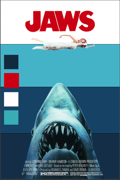
I chose the famous movie poster from the Steven Spielberg movie Jaws. I knew that I wanted to analyze a movie poster and Jaws was one that immediately sprung to my mind. Although it is visually simple, it is intensely memorable. I decided to figure out why this movie poster is such a staple in classic American film.

Hierarchy
There are three main elements in the poster: the title, the woman, and the shark. They are all approximately the same width and are all centered within the page. However, in terms of height, the shark takes almost 50% of the poster height, and all it's showing is its head. This loudly informs the audience that this shark is more monster than animal.

Here to the right, you can easily see how imposing the image of the shark is when compared to the title and the woman. Another thing to note is that the woman is caught in between these two other elements. She is visually caught between two sets of jaws. She has nowhere to go, and we feel the peril that she herself has yet to even acknowledge.

Color palette
There are three main colors in the poster: red, white, and blue. The film takes place during the 4th of July, so the color scheme works in regard to subverting the general fun and carefree that we usually associate to this holiday. The red JAWS title invokes a sense of danger and the color of blood in the water.

There are many shades of blue in this poster. It starts with a light shade of blue where the water meets the sky. It then gets darker and darker as the water gets deeper, representing the ominous and dangers that are waiting underneath the waters. As seen to the right, the white background only takes up about 25% of the poster. The rest of the poster is blue, which feeds into the unknown fears we have of the sea.
Typography/Negative space
The closest font that I could find for the title is Franklin Gothic Bold. There is a font out there named Amity Jack, but that font was created in 2009 so it was likely inspired by the movie. The A, W, and S follow the Franklin Gothic Bold typography closely, however the J seems to have been altered. The end is angled and cutoff, creating a fishhook like image. I also noticed that the sharp triangles in the A and W created by the negative space look a bit like teeth, which enhances my previous point on how the woman is about to be eaten by two sets of jaws.

The Jaws poster is one of the most memorable aspects of this great film. It's simplicity and color scheme invokes many feelings about the dangers of the unknown. I no longer watch movie trailers since they give away too much of the plot of a film, so I am paying much more attention to movie posters these days. Although most are generically bland and uninspired, when I do see an interesting poster, it will lure me to the theater like no other.
