Unconscious Data: Sensor

I plan on using a heartbeat/pulse sensor as my "unconscious data" sensor. I am curious to see how external forms of entertainment effect the heart rate.

Netflix and other online streaming services have been releasing entire seasons of their produced television shows at a time. Many of these shows tend to be binged immediately after their release. I wish to understand how each episode and season of these shows are structured in order to keep the viewers hooked by analyzing the data of the viewer's heartrate throughout their viewing.

3D Object Deconstruction

For this week's assignment for Piecing It Together, we were to take an object and deconstruct it into 2D pieces. I chose my trust water bottle.

I found it easier to split up the bottle into sections and subsections. The two main sections are the container and the cap.

The best way for me to construct the container would be to build it upwards layer by layer. The base of the container is smaller in area than the top, so as the layers placed would need to gradually increase in size. The container also has ridges on its sides. These ridges would also have to be gradually incorporated into the layers.

I separated the cap into four different subsections. This helped me visualize how to build each part of the cap. Sections A, B, and C are pretty straightforward. For section D, I decided on the same layering technique, but this time on an angle. 

This exercise was interesting as it forced me to think about objects in different dimensions. It also made me appreciate my water bottle a lot more. I take it for granted sometimes.

F is For Fake

Spoilers for F is For Fake below.

So the big twist is that the last twenty minutes of the movie is fictional. It's also the most lucidly told portion of the film. I found myself not understanding or following a great portion of the first part of the film. The way the film is cut and put together is wild and rhythmic, perhaps mimicking the confusing nature trying to piece together a coherent story from real facts.

However, when the Welles starts to tell the fake story of Picasso, the editing style of the film shifts and slows down considerably. His train of thought style of telling the previous stories comes to a halt to focus on the Picasso story. This magic trick was incredibly effective because it conveyed the message and subject of the film without having overly explain.... until Welles explains it all. I only wish Welles did not reveal his magic trick to the audience so bluntly. But perhaps it was necessary to clearly demonstrate how the magic of a piece of art can be ruined by revealing all of the facts.

Facts can be boring and can contradict common sense and logic. Movies that are "based on a true story" are movies based on facts. Yet these movies rarely stick 100% with the facts given, because these facts can disrupt conventions of storytelling. Of course facts should always stay factual in real life, but when it comes to art, I feel that distorting these facts to fit an emotion or a feeling is necessary. Like sleight of hand, the true skill of an artist lies in entrapping the consumer in the art, by not giving them the chance to overthink what just happened because they are simply lost in the moment.

Intro to Comp Media: DriVR prototype

For this week's assignment, I started to work on a digital prototype for an idea I have for the p.comp final. I want to create a device that allows you to edit and direct your own car chase movie scene. The device would be a steering wheel, an accelerator, and a brake pedal. For this prototype, I've turned the functions of the components to key presses on a keyboard. The left and right arrows would represent the steering wheel, the up arrow is the accelerator, and the down arrow is the brake. When you turn the wheel, the car chase scene switches to another scene from another movie. Accelerating and braking would speed and slow down the scene. 

I had several issues with loading these car chase scenes, I think mostly due to the web editor. I was first unable to upload clips more than 10mb (later the limit decreased to 5mb). I was also unable to find the path of the uploaded files programmatically. It looks like the web editor automatically translates file paths of uploaded files to the actual file path on the amazon web servers. I think once I set up a local environment, most of these issues will be fixed.

code here

Intro to Phys Comp: Final Ideas

I want to get my hands dirty with interactive storytelling, so I want to create a project that allows the user to be a part of a film. An idea I have is a Car Chase Simulator. 

The user interface would be the obvious car parts: a steering wheel, a gas and brake pedal, and a gear shifter. There would also need to be a screen to display video, preferably a wide one to simulate the front windshield. The user would start the movie by starting the car. As the user controls the wheel and pedals, the movie changes to different scenes. There would be a large collection of car chase footage from famous movies, so when the user turns left, the scene would change depending on the current state of the movie.

IMG_20161031_173305212.jpg

Just thinking about the process of creating this project is giving me a slight panic attack. Although I have a good idea of how all the user inputs would work, the thought of recreating the interior of a car and collecting hundreds of car chase movie clips, and editing them, and then coding the logic... It's a lot of work! But I think it's doable with the skills I currently have. This project would combine a lot of the skills I have and are learning at ITP.


Intro to Phys Comp: Spooky Midterm

Halloween isn't scary enough these days. My partner Rogue and I wanted to create something that would shock and frighten. We created something not of this world. We created... a ghost.

AKA a silhouette of a Halloween mask that follows you around. Spooky!

Since the midterm project was to be Halloween related, I wanted to make something that would primarily be used in the dark. We ended up deciding on a device that detects a user walking along a surface, and depending on where the location the user is currently at on the surface, project a shadow at a corresponding location on the wall.

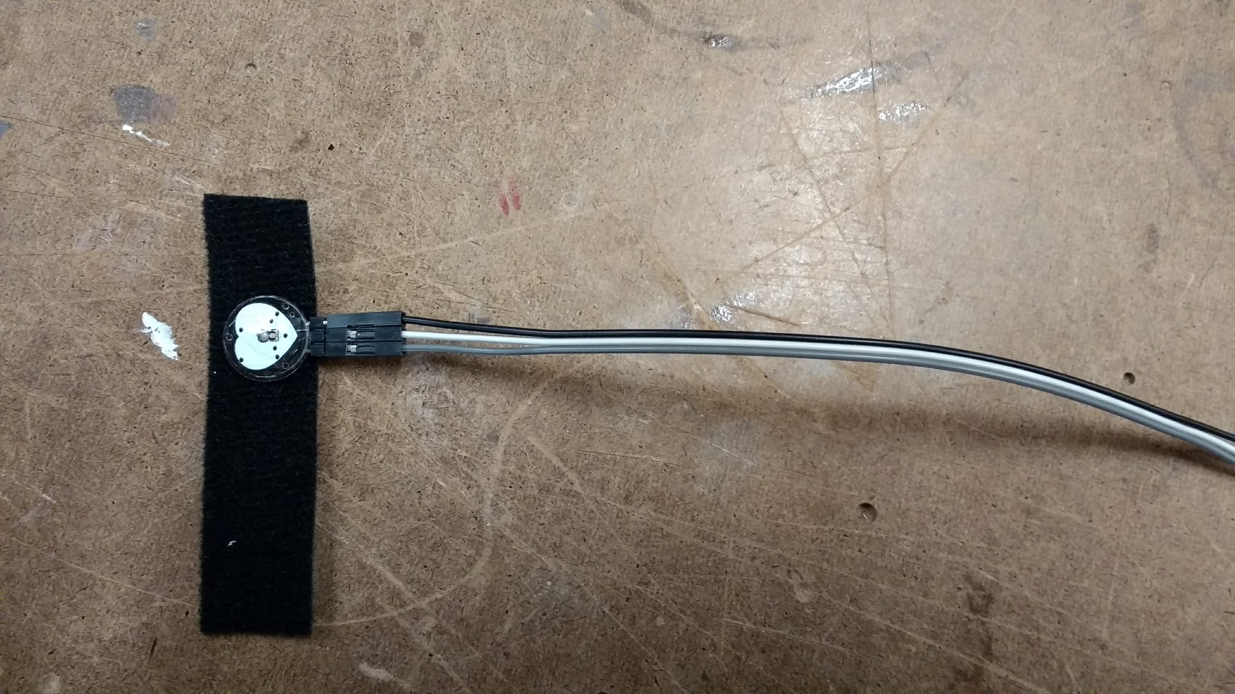
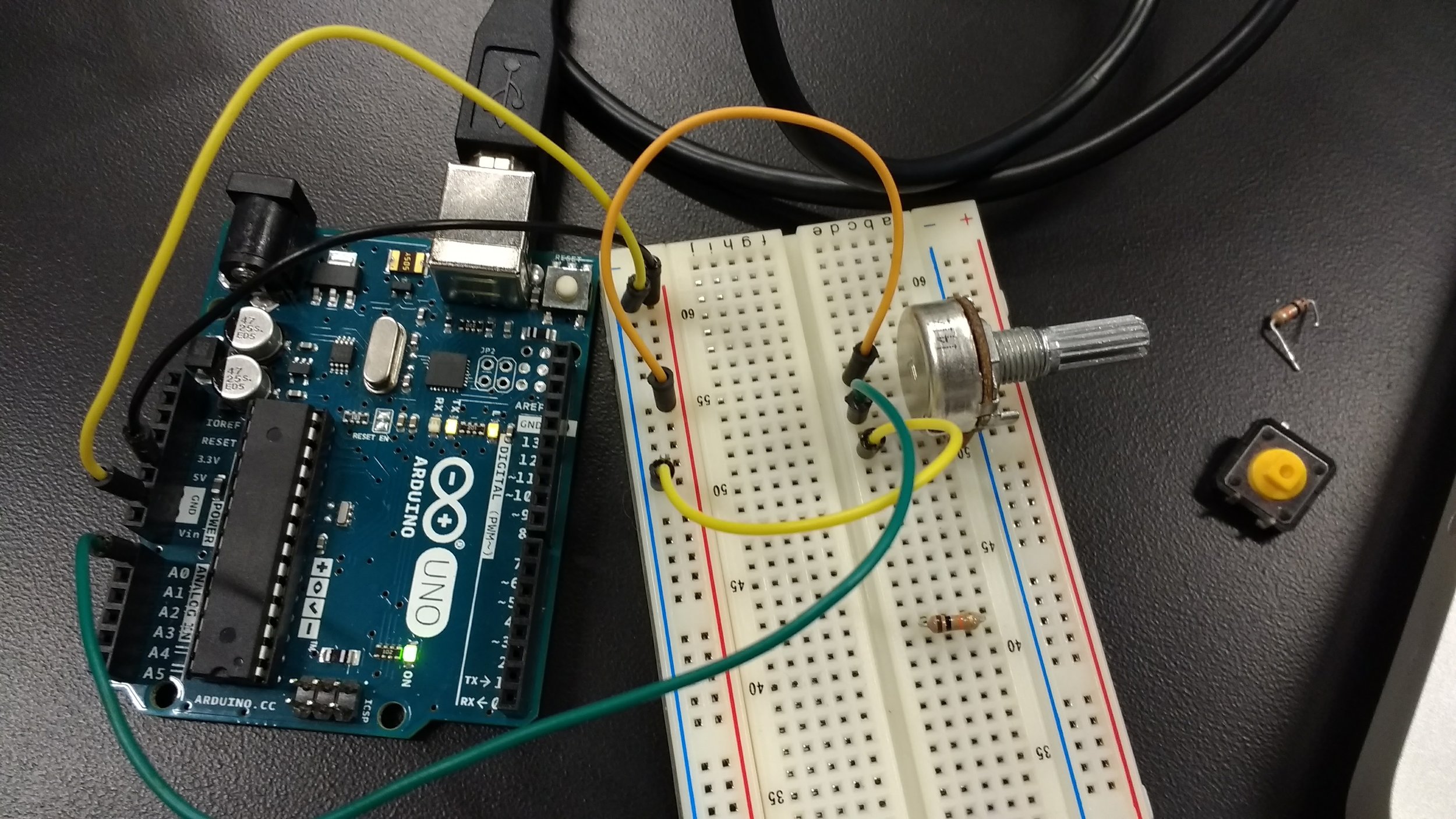
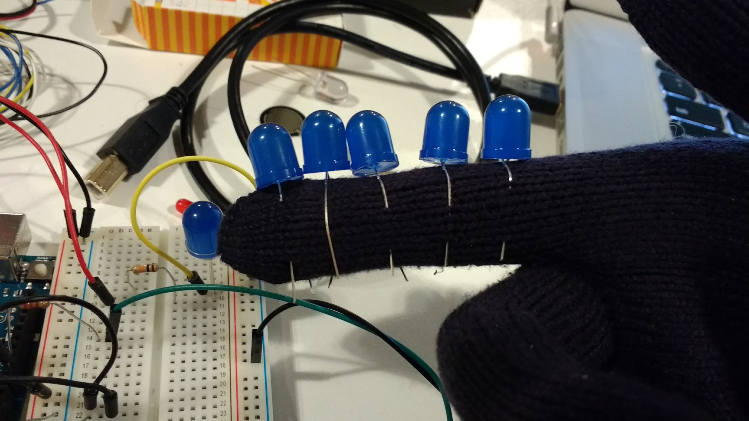
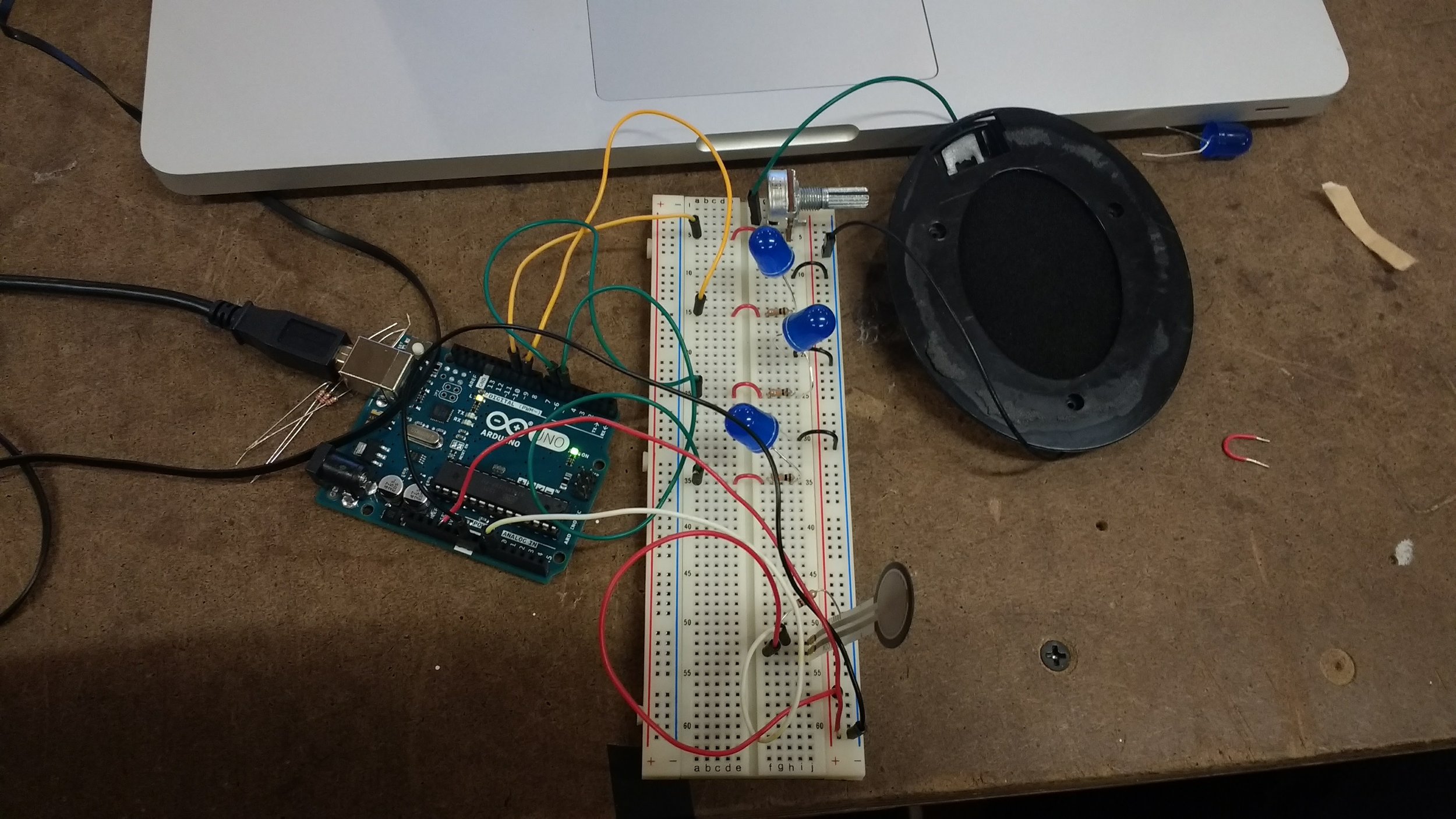
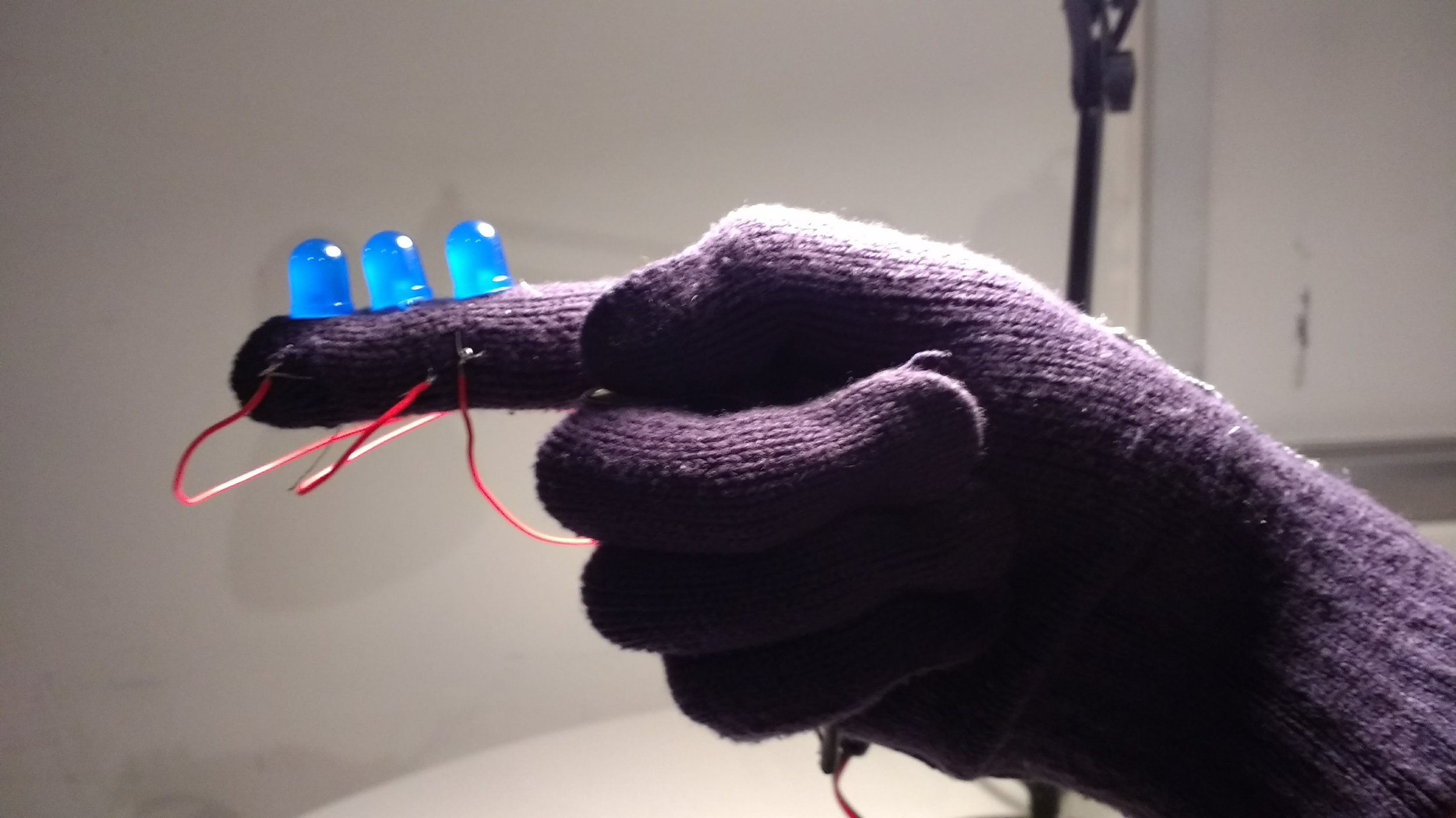
Our main component to detect the user interaction would be several FSRs embedded underneath a cardboard walkway. The input data from these FSRs are then used to light up specific blue LEDs. The LED will light up depending on which FSR the user has currently applied pressure to. The light from each LED would then cast a shadow off of a central mask, creating a silhouette on the wall.

The circuit design of this project was fairly simple, however the hard part was implementing it into something tangible that a user could use. Our project required a lot of space which was something that Rogue and I were not too accustomed to in our past physical computing projects. The most difficult part was probably the angling and positioning of the lights in order to cast a nice silhouette on the wall. Below is a short montage video that details the process of how we built this project.

Documentation for Ghost Stalk

Issues/Stuff we wish we could have done better

Rogue and I ran into a lot of issues that we had to compromise with in order to finish the project. We had originally intended for the mask to also move by using a servo motor. The motor would then move as the user walks through the cardboard path. Unfortunately, when using the Servo library in Arduino, two pins are disabled (9 and 10). This loss of real estate would not allow us to use the four LEDs, so we decided to do without the motor for now. A solution to that problem was to perhaps use another Arduino board. 

We had also originally wanted to use Red/Yellow/Orange LEDs to cast the light since it fit more with the theme. However, the silhouette created by these warmer colors were not as clear as the blue LED lights, so we had to again scrap an idea. Jeff mentioned how a stronger light source would have made the project much better and I agreed. I hope we learn how to implement stronger components to our projects in future classes.

Overall, the midterm project was an amazing learning experience for me. Being able to turn a kind of silly idea into a working prototype in such a short amount of time was something I had doubts on. But now I know I can do it! Thanks again to Rogue Fong for being a great partner. 


Intro to Comp Media: ITPness

Some guy compiled a 25k+ entry'd json of comments from pornhub content. I decided to use it in this week's assignment. It probably wasn't the best idea, but by the time I realized that, I was already too far in.

These comments were like 99% incredibly vulgar, so I first decided to clean up the language a bit by replacing certain "bad" words with a "good alternative". I used the same data structure that I used for my Morse code translation in my previous assignment. The replacing of these words reminded me of the R rated movies shown on like TNT or something and how they would have dubbed lines over swear words.

As these new translations started printing out, some of them actually reminded me of comments people would say to others for their first couple ICM assignments. So I took several ICM projects from the first week and imported them into my project (sorry, I didn't ask for permission. let me know if you want them taken down!)

Finally, I implemented it so that several users(someone from the class) would "comment" on a random p5.js sketch, simulating a live stream of comments like you would see on video streaming sites such as... YouTube. These comments are PG-ified to the best of my abilities.

After reading through hundreds of these pornhub comments, I experienced a numbness in my brain. Censorship became such a meaningless concept to me during this time of desensitization. Not sure where I'm going with this, but if you want to see the unedited versions of the comments, you can comment out "c = filterBadWord(c);" in the code. 

code here

Visual Language: Taipei Logo

This week's assignment was to create a logo for a city of my choice. I chose Taipei, the capital of Taiwan.

I first analyzed the Chinese characters and the meaning behind them. I then created a mind map of what Taipei means to me. I also asked several of my classmates who have been or lived in Taipei to give me some additional feedback. 

With this information, I started sketching out some possible logos. My process was basically trying to combine two or three of the identities that were present in the mindmap. 

I knew that I wanted to incorporate food into the logo because everybody associates Taipei with the street food available at the iconic night markets. Another identity I wish to incorporate was the moped/scooter. These are everywhere in Taipei and remind me of the city whenever I see one. Lastly, was the Taipei 101 skyscraper. I was at first very hesitant to incorporate the building since it seemed so cliche. But it was hard for me not to include it due to its overwhelming presence in the city. 

I eventually ended up incorporating the food and the 101 identities for my logo, mostly inspired by a stack of bowls. Taipei 101's unique structure looks like several sections of the building are stacked on top of each other. I then used bowls because one of Taipei's most famous foods is the Taiwanese beef noodle soup. After sketching out a rough sketch, I started working on the logo digitally.

Above was the first draft of my logo. I found that the heat lines at the top of the logo did not look right. I wanted to show heat because the temperature in Taipei is incredibly hot and humid, but these heat lines didn't really convey this sort of intense heat. It eventually led me to turn these heat lines into noodles. I also felt that the removal of the outlines made the logo feel a lot less cartoony and cliparty.

Here is the final product. I put together several logos using different colors. I also situated them on a moped helmet and a t-shirt.

Special thanks to Siman Li for helping me in this design progress!

Intro to Comp Media: Morso

Play the game here!

View code here.

I created a little game that kind of teaches you morse code. I used two DOM elements: a button to start the game and a textfield to input the text that you wish to play with.

I had some trouble centering some of the DOM elements. I tried to add a div, but I wasn't too sure on how to add already created elements to it. There are also a lot of other features that I wish to incorporate into Morso:

  • collision detection between Morso and the morse code
  • multiple difficulties
  • more visual effects

Hopefully I will be able to incorporate some physical computing elements to this project it with a real morse code dialer!

Intro to Phys Comp: Serial Input

I decided to control an ICM project that's still a work in progress. I used two potentiometers as analog inputs to control the movement of an ellipse and a line.

For the Serial input, I used a ":" as a delimiter to separate the two analog inputs. I then mapped 

In p5.js, I used the split function to grab the two analog values of the potentiometer. I then mapped the values to a range that's suitable for my sketch. One value controlled the amplitude, the other value controlled the frequency.

The end result worked exactly as how I expected. Having the option to use multiple analog and digital inputs opens so many possibilities for future projects. Because I will be continuing to work on this p5 project, I have many ideas of how to incorporate physical input to its final form.

Video and Sound: Final Cut

Strangers in one life may be intertwined in a previous. The LLAMA allows you to relive your past incarnations.

Strangers in one life may be intertwined in a previous life. The LLAMA Relive allows you to experience your past incarnations. For the Video and Sound class at NYU ITP Created by Annie Kim, Bryan Hsu, and Diana Na

By Annie Kim, Diana Na, and me

Visual Language: Business Card

Here's my business card! It took me a long time to come up with an idea of what I wanted. I originally wanted to try to use lots of noise and "overwhelm the eye", but it looked way too messy and unprofessional. Software engineers should not be known for their messy code, so I scrapped that idea and went for something a bit more clean and minimalistic. 

I used the color red because it is a very lucky and strong color in Chinese culture. I also used two non-serif fonts (Futura and Avenir) as my type because I liked how clean it looked with the card. My name being on the edge of the card was done so that the first thing a person would see when pulling out my business card would be my name.

Since I did not come from a design background, I asked a couple of my classmates who do for advice and inspiration. Special thanks to Diana Na and Grau Recarens for the help!

ICM + PComp: Synthesis

For the synthesis, Stephanie and I implemented a physical analog input into our previous p5.js projects. For Steph's project, we used an FSR to simulate her rain sketch. The harder the FSR is pressed, the more the rain falls.

As for my project, I used a potentiometer to control my "Repetition" p5.js sketch. (https://alpha.editor.p5js.org/projects/SyZG0BV6)

I had some trouble setting up the connectivity between the Arduino and the p5 library, but eventually got it after some troubleshooting. In the original sketch, I controlled the animation by holding and releasing the mouse button. After reading the values from the analog input of the potentiometer, I changed the original code of the sketch to control the animation based off those physical variables.

https://alpha.editor.p5js.org/projects/SyZG0BV6

Intro to Phys Comp: Analog Output

Mega Man was my inspiration for the lab this week.

During last week's class, the analog sound output reminded me of Mega Man's charge shot sound effect. So I decided to create a toy that kind of replicates all of the functionalities of Mega Man's blaster... sans the blaster part. I had some old gloves lying around, so I figure I'd use that as the form for my project. 

I sat and stared at my hand for longer than I would have liked. It was very difficult for me to wrap my head around designing the circuit around my glove. After wrecking my brain for a good half hour, I decided to set up the project on my breadboard first.

Setting up the project on a breadboard was surprisingly easy. It didn't take long for me to create the circuitry of what I wanted in my head. I used the FSR as an analog input, and several LEDs and a speaker for the analog output. As the user presses down harder and harder on the FSR, the brightness of the lights and the pitch of the sound coming from the speaker both get higher. This is to simulate the "charging" of the toy gun. And then depending on when the user lets go of the FSR, a "blast" sound will output. The type of sound depends on the number of LEDs that the user manages to light up. 

Now that all I had to do was "copy" what I had just done, except onto a glove. Now that I had a template, it was much easier to implement. I had to learn some new tricks, such as soldering wires to my FSR. I also used some conductive thread, which I didn't think was necessary, but thought what the heck. It took me a decent amount of time to connect it all, especially since I only one had for most of the time since my right hand was often used as a mannequin.

I definitely did not do everything as efficiently as I could have, but I think it was a good learning experience for me to kind of hack my way into getting what I wanted done. I'm sure to ask a little more help from my more experienced peers next time. I need to improve on how to present my prototypes a bit more aesthetically. 

As for the Arduino code, it wasn't too complicated. I used some of the logic from my previous piano project to detect when the user has released the FSR. Other than that, the major difference was that I had to map the range of values needed for the brightness and frequency. I mapped the brightness to several ranges in order to get the LEDs to gradually increase in brightness one by one. Below is the code:


Visual Language: Color

Here's my score for the hue test. I think the scoring system is not totally right...

Since I started school at ITP, my life has been elevators, subways, and sometimes some trees. Although it sounds a bit sad, I'm still enjoying myself. 

The below image consists of the main colors from my collected photos. The hierarchy I chose is simply the altitude where these colors appear. For example, from blue skies, to green trees. To the grey elevators and to the eclectic colors I see in the advertisements of the N and R trains. This eyeball represents the sort of insomnia I'm experiencing these days.

Intro to Comp Media: Repetition

https://alpha.editor.p5js.org/projects/SyZG0BV6

In this week's assignment, Grau and I created a sketch that includes differently sized circles depending on the position of the mouse. These circles will then grow or shrink depending on the mouse state (clicked or released, respectively). The user is able to stop and start the circles from changing by hitting any button on the keyboard.

We took a bit of inspiration from both mine and Grau's previous assignments. The growing and shrinking circle was a new feature in Grau's assignment, and the logic for changing colors and size depending on the mouse position was from my previous assignment. We combined these features and added the logic that calculates the distance from any circle to the mouse. The interaction was then added so that the user is able to control the expansion and reduction of the circles.

Intro to Phys Comp: Observation

I chose the elevator at ITP to observe for this week's assignment. One aspect I have always enjoyed about an elevator is that it gave a physical feedback that is uncommon in most other technologies: momentum. Although momentum is found in almost every mode of transportation, an elevator is different because there are usually no windows. You must rely on your sense of momentum to determine if something has gone horribly wrong.

Assumptions and expected results:

People request an elevator to go up or down. They get in the elevator and select the floor they wish to go on. Once enough time has gone by with no interruptions, the elevator goes to the desired floors. The doors open and the person exits. It is always used when a person needs to travel vertically within a building.

Some observations:

  • A solo ride takes approximately 20 seconds from door opening to stepping outside of the door on the fourth floor. A group ride right before class takes 45 seconds, more than double of that.
  • Riders almost always face towards the door, unless they are with friends.
  • The time it takes to wait for an elevator varies depending on the current status of the elevator. It has taken up to 95 seconds at times.
  • The behavior of the users also depend on the order they get into the elevator. Early riders will always press the button they wish to get on. Late riders were more often to check the light that indicates a pressed floor, but they usually press the button regardless. 

A design flaw I noticed is that the complexity of the elevator increases depending on the number of people simultaneously using it. There is also the issue of people having to squeeze through others in order to get off on their floors. This is a big problem with the large elevator in ITP due to it's shape. Unlike most elevators which have the door centered, the large elevator at ITP is off to one side of the rectangular space inside. This makes it harder for the other riders to move aside for riders that need to disembark the elevator.

In the readings, there was detail on how aesthetics can make a design feel so much better to a user, even if the functionality remains the same. I can immediately relate to this in regard to elevators. The elevator for my apartment building is very new. It's silver, shiny, and glossy. Even though the functionality between the elevator at ITP and my apartment are approximately the same, the elevator in my apartment feels cold yet luxurious while the elevator in ITP feels familiar and a bit rundown.